Matplotlib Datetime Axis with Log Scale and Secondary Axis
python matplotlib datetime axis log scale and secondary axis: Combine a datetime axis with a log scale and secondary axis in matplotlib. This guide shows the conversio...
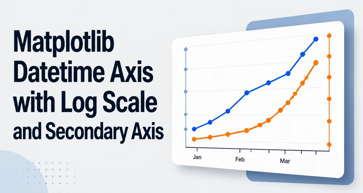
python matplotlib datetime axis log scale and secondary axis requires a clear understanding of the core syntax, runtime behavior, and practical implementation patterns demonstrated in the examples below.
When you try to set a log scale on a matplotlib axis that contains datetime objects, you'll often get an error or a blank plot. The reason is that matplotlib's log scale expects numeric values, and datetime objects are not directly compatible. This article explains how to combine a datetime axis with a log scale and a secondary axis in Python matplotlib.
The Problem with Datetime and Log Scale
Matplotlib's set_xscale('log') and set_yscale('log') methods internally apply a logarithmic transformation to the axis data. For this to work, the data must be positive real numbers. Datetime objects are not numbers; they are a distinct type that matplotlib handles through a date converter. When you pass datetime objects directly to a plot function and then try to set a log scale, you may see an error like ValueError: Data has no positive values, and therefore can not be log-scaled. or the axis simply doesn't render as expected.
The core issue is that datetime objects are converted to a numeric representation (days since a reference date) only when the axis is formatted as a date axis. This conversion happens after the scale is set, so the log scale sees the original datetime objects, not the numeric values.
Converting Datetime to Numeric Values for Log Scale
The standard workaround is to convert datetime objects to numeric values yourself before plotting. Use matplotlib.dates.date2num to get a float representing days since the epoch (0001-01-01 UTC). These numbers are positive for any modern date, so they can be used with a log scale.
import matplotlib.pyplot as plt
import matplotlib.dates as mdates
from datetime import datetime

dates = [datetime(2023, 1, 1), datetime(2023, 2, 1), datetime(2023, 3, 1)]
values = [10, 100, 1000]

# Convert dates to numeric values
numeric_dates = mdates.date2num(dates)

fig, ax = plt.subplots()
ax.plot(numeric_dates, values)
ax.set_xscale('log')
plt.show()
Now the x-axis uses numeric values, and the log scale works. But the tick labels will display numbers like 738156.0, not dates. To restore date labels, you need a secondary axis.
Creating a Secondary X-Axis for Date Labels
A secondary x-axis can display the original date labels while the primary axis holds the numeric log-scaled values. Use ax.secondary_xaxis to create a twin axis positioned at the same location. Then set its limits to match the numeric range and format its ticks with a DateFormatter.
import matplotlib.pyplot as plt
import matplotlib.dates as mdates
from datetime import datetime

dates = [datetime(2023, 1, 1), datetime(2023, 2, 1), datetime(2023, 3, 1)]
values = [10, 100, 1000]

numeric_dates = mdates.date2num(dates)

fig, ax = plt.subplots()
ax.plot(numeric_dates, values)
ax.set_xscale('log')

# Create secondary x-axis for date labels
secax = ax.secondary_xaxis('bottom')
secax.set_xlim(ax.get_xlim())
secax.xaxis.set_major_formatter(mdates.DateFormatter('%Y-%m-%d'))
secax.xaxis.set_major_locator(mdates.DayLocator(interval=1))

plt.show()
The secondary axis uses the same numeric limits as the primary axis, so the date labels align correctly with the log-scaled positions. This approach gives you the log scale on the primary axis and human-readable dates on the secondary axis.
Using a Secondary Y-Axis for a Second Series
Sometimes "secondary axis" refers to a second y-axis for plotting a different data range. This is independent of the log scale issue but often appears in the same plot. Use ax.twinx() to create a secondary y-axis, then plot your second series on it.
import matplotlib.pyplot as plt
import matplotlib.dates as mdates
from datetime import datetime

dates = [datetime(2023, 1, 1), datetime(2023, 2, 1), datetime(2023, 3, 1)]
values1 = [10, 100, 1000]
values2 = [0.5, 0.2, 0.1]

numeric_dates = mdates.date2num(dates)

fig, ax1 = plt.subplots()
ax1.plot(numeric_dates, values1, color='blue')
ax1.set_xscale('log')
ax1.set_ylabel('Primary series')

ax2 = ax1.twinx()
ax2.plot(numeric_dates, values2, color='orange')
ax2.set_ylabel('Secondary series')

# Format the x-axis as dates
ax1.xaxis.set_major_formatter(mdates.DateFormatter('%Y-%m-%d'))
ax1.xaxis.set_major_locator(mdates.DayLocator(interval=1))

plt.show()
Here the primary y-axis is on the left, the secondary on the right. The x-axis is still numeric with a log scale, but we've applied a date formatter directly to the primary axis. This works because the numeric values are within the range that DateFormatter can interpret.
Handling Common Pitfalls
- Non-positive values: Log scale requires positive values. If your numeric dates are negative (for dates before 0001-01-01, which is unlikely), you'll get errors. Ensure your dates are in the Common Era.
- Date formatting on a log-scaled axis: When you use a
DateFormatterdirectly on a log-scaled axis, the tick locations are chosen by the log locator, which may not align with the date locator you want. Using a secondary axis gives you more control over tick placement. - Secondary axis alignment: If you use both a secondary x-axis and a secondary y-axis, ensure they share the same numeric x limits. Mismatched limits can cause the date labels to drift from the data points.
When to Use a Secondary Axis vs. Custom Formatter
A secondary axis is the cleanest way to combine a log scale with date labels because it separates the numeric transformation from the display formatting. A custom formatter can work if you only need to show a few dates and the log locator happens to place ticks at those dates, but it's fragile.
| Approach | Pros | Cons |
|---|---|---|
| Secondary x-axis | Full control over tick positions and formatting; independent of log locator | Slightly more code; requires syncing limits |
| Custom formatter | Simpler code; no extra axis | Ticks may not align with dates; requires manual locator tuning |
In practice, use a secondary axis when you need precise date labels on a log-scaled plot. Use a custom formatter only for quick exploratory plots where approximate labels are acceptable.
Practical Considerations for Production Plots
When building a plot for a report or dashboard, think about how the log scale affects the visual interpretation of time intervals. On a log scale, equal distances on the axis represent multiplicative changes, not equal time spans. This can be misleading for time series data. Always annotate the scale clearly or add a note in the figure caption.
Also, be aware that date2num returns values relative to a reference date. If you need to plot data spanning several orders of magnitude in time (e.g., milliseconds to years), consider using a different numeric representation, such as Unix timestamps, but ensure they are positive. The same secondary-axis technique works with any numeric representation.
Finally, test your plot with different date ranges and log scale limits. The secondary axis must be updated whenever you change the primary axis limits, so consider using a callback with ax.callbacks.connect('xlim_changed', ...) to keep the secondary axis in sync automatically.