Python Matplotlib: Line, Bar, Scatter, Histogram, and Pie Charts
python matplotlib line bar scatter histogram and pie charts: Learn to create line, bar, scatter, histogram, and pie charts with Python Matplotlib, including code examp...
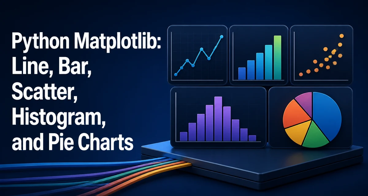
python matplotlib line bar scatter histogram and pie charts requires a clear understanding of the core syntax, runtime behavior, and practical implementation patterns demonstrated in the examples below.
When you need to visualize data in Python, matplotlib is the most widely used library for creating line, bar, scatter, histogram, and pie charts. This article walks through each chart type with practical code examples and explains when each is appropriate. You'll learn the core plotting functions, how to customize them, and how to avoid common mistakes.
Setting Up Matplotlib and Basic Figure Management
Before drawing any chart, you need to import matplotlib and understand the figure/axes model. A figure is the entire window or canvas, while an axes is a single plot within that figure. Most plotting functions are called on an axes object, either directly or through the pyplot interface.
import matplotlib.pyplot as plt

# Create a figure and a single axes
fig, ax = plt.subplots()

# Plot something simple
ax.plot([1, 2, 3], [4, 5, 6])

# Display the figure
plt.show()
The plt.subplots() function returns a figure and one or more axes. When you call ax.plot(), you're adding data to that axes. The plt.show() command renders the figure in a window if you're in an interactive environment, or it saves the figure if you call plt.savefig() instead.
For a script that runs without a display, use plt.savefig('chart.png') instead of plt.show(). The figure and axes model becomes important when you need multiple subplots, but for the chart types in this article, a single axes is sufficient.
Line Charts: Tracking Trends Over Time
Line charts are the default choice for showing how a variable changes over a continuous interval, such as time. The plot function connects data points with straight lines, making it easy to spot trends, cycles, and outliers.
import matplotlib.pyplot as plt

months = ['Jan', 'Feb', 'Mar', 'Apr', 'May', 'Jun']
revenue = [120, 135, 128, 150, 165, 172]

fig, ax = plt.subplots()
ax.plot(months, revenue)
ax.set_xlabel('Month')
ax.set_ylabel('Revenue (k$)')
ax.set_title('Monthly Revenue')
plt.show()
By default, ax.plot() draws a solid line with no markers. If you want to emphasize individual data points, add the marker parameter:
ax.plot(months, revenue, marker='o')
Common markers include 'o' (circle), 's' (square), and '^' (triangle). The linestyle parameter controls the line style: '-' for solid, '--' for dashed, ':' for dotted, and '-.' for dash-dot.
Line charts are best when the x-axis represents a continuous variable like time or distance. If the x-axis is categorical, a bar chart is usually more appropriate because it doesn't imply a continuous relationship.
Bar Charts: Comparing Categories
Bar charts compare discrete categories using rectangular bars. The height (or length) of each bar is proportional to the value it represents. Matplotlib provides bar for vertical bars and barh for horizontal bars.
import matplotlib.pyplot as plt

categories = ['Apples', 'Bananas', 'Cherries', 'Dates']
quantities = [30, 45, 20, 35]

fig, ax = plt.subplots()
ax.bar(categories, quantities)
ax.set_xlabel('Fruit')
ax.set_ylabel('Quantity')
ax.set_title('Fruit Inventory')
plt.show()
For horizontal bars, use ax.barh(categories, quantities). Horizontal bars are useful when category names are long or when you have many categories.
You can adjust the bar width with the width parameter (default 0.8). To compare two series side by side, you can offset the bars manually:
import numpy as np

x = np.arange(len(categories))  # numeric positions
width = 0.35

fig, ax = plt.subplots()
bar1 = ax.bar(x - width/2, quantities, width, label='2024')
bar2 = ax.bar(x + width/2, quantities_2025, width, label='2025')
ax.set_xticks(x)
ax.set_xticklabels(categories)
ax.legend()
plt.show()
This pattern requires converting categories to numeric positions and then adjusting the x-coordinates. It's a common technique for grouped bar charts.
Scatter Plots: Exploring Relationships Between Variables
Scatter plots display individual data points on a two-dimensional plane, making them ideal for revealing correlations, clusters, and outliers. Use scatter when you have paired numeric values and want to see how they relate.
import matplotlib.pyplot as plt

x = [1, 2, 3, 4, 5, 6, 7, 8]
y = [2, 4, 5, 4, 6, 8, 9, 10]

fig, ax = plt.subplots()
ax.scatter(x, y)
ax.set_xlabel('Study Hours')
ax.set_ylabel('Exam Score')
ax.set_title('Study Hours vs. Exam Score')
plt.show()
You can encode additional dimensions using the s (size), c (color), and alpha (transparency) parameters. For example, you might size points by population and color them by region:
ax.scatter(x, y, s=population, c=region_codes, alpha=0.6)
When you have many overlapping points, transparency (alpha) helps reveal density. For very large datasets, consider using a hexbin plot or a 2D histogram instead, because scatter plots can become unreadable with thousands of points.
Histograms: Understanding Distributions
A histogram groups continuous data into bins and shows the frequency of values within each bin. It's the standard way to visualize the distribution of a single variable.
import matplotlib.pyplot as plt

# Example data: exam scores
scores = [55, 62, 68, 71, 73, 75, 78, 80, 82, 84, 87, 90, 93, 95, 98]

fig, ax = plt.subplots()
ax.hist(scores, bins=5)
ax.set_xlabel('Score')
ax.set_ylabel('Frequency')
ax.set_title('Distribution of Exam Scores')
plt.show()
The bins parameter controls the number of intervals. Choosing the right bin count is important: too few bins hide details, too many bins create noise. Matplotlib uses a heuristic by default, but you can pass an integer, a sequence of bin edges, or a string like 'auto' to let numpy choose.
ax.hist(scores, bins='auto') # automatic bin selection
You can also plot a cumulative distribution by setting cumulative=True. To overlay a probability density, use density=True, which normalizes the histogram so the total area equals 1.
Pie Charts: Showing Proportions (with Caution)
Pie charts display parts of a whole as slices. Matplotlib's pie function is straightforward, but pie charts are often criticized because humans are better at comparing lengths than angles. Use them only when you have a small number of categories (fewer than six) and the proportions are clearly different.
import matplotlib.pyplot as plt

labels = ['Python', 'Java', 'C++', 'JavaScript']
usage = [45, 25, 20, 10]

fig, ax = plt.subplots()
ax.pie(usage, labels=labels, autopct='%1.1f%%')
ax.set_title('Programming Language Usage')
plt.show()
The autopct parameter formats the percentage labels. You can also explode a slice for emphasis:
ax.pie(usage, labels=labels, autopct='%1.1f%%', explode=[0, 0.1, 0, 0])
A key limitation is that pie charts don't handle small slices well. If a category is below 5%, its label and percentage become hard to read. In that case, a bar chart is usually a better choice.
Customizing Charts: Labels, Colors, and Styles
All chart types share common customization options. You can set axis labels, titles, limits, grid lines, and colors to make the chart readable and publication-ready.
fig, ax = plt.subplots()
ax.plot(x, y, color='#2E86AB', linewidth=2)
ax.set_xlabel('X Label', fontsize=12)
ax.set_ylabel('Y Label', fontsize=12)
ax.set_title('Customized Chart', fontweight='bold')
ax.grid(True, linestyle='--', alpha=0.6)
ax.set_xlim(0, 10)
ax.set_ylim(0, 12)
plt.show()
Matplotlib provides named colors ('red', 'blue'), hex codes, and RGB tuples. For consistent styling across multiple charts, you can use a style sheet:
plt.style.use('seaborn-v0_8-whitegrid')
Common style names include 'ggplot', 'bmh', and 'fivethirtyeight'. Styles affect the default colors, grid, and background, giving your charts a cohesive look without manual tweaking.
Choosing the Right Chart for Your Data
The chart type should match the message you want to convey. Here's a quick reference based on the nature of your data:
| Chart Type | Best For | Data Requirement |
|---|---|---|
| Line | Trends over continuous intervals | X-axis is ordered numeric or datetime |
| Bar | Comparing discrete categories | X-axis is categorical, Y-axis is numeric |
| Scatter | Relationship between two numeric variables | Both axes are numeric, paired observations |
| Histogram | Distribution of a single numeric variable | One numeric variable, continuous |
| Pie | Proportion of a whole | Categories sum to 100%, few categories |
If you're unsure, start with a bar chart for categorical comparisons and a line chart for time series. Scatter plots are useful when you suspect a correlation, and histograms are the first step in understanding any numeric variable's distribution.
Common Pitfalls and How to Avoid Them
Several mistakes frequently appear when creating these charts. Knowing them helps you produce accurate and honest visualizations.
Pie chart ordering: Slices are drawn counterclockwise starting at the top. If you want a specific order, sort your data before plotting. For example, to show largest to smallest, sort the values descending.
Histogram bin sensitivity: The same data can look very different with different bin widths. Always check whether the chosen bins obscure important features. Use bins='auto' as a starting point and adjust manually if needed.
Scatter plot overplotting: When many points overlap, you can't see density. Reduce the marker size, increase transparency, or use a 2D histogram (ax.hist2d) for large datasets.
Line chart with categorical x-axis: If your x-axis contains strings like ['Mon', 'Tue', 'Wed'], matplotlib treats them as equally spaced categories. That's misleading if the intervals are not equal. Use a bar chart instead.
Forgetting to call plt.tight_layout(): When labels or titles are cut off, plt.tight_layout() adjusts spacing automatically. Call it before plt.show() or plt.savefig() to avoid clipped text.
Saving figures with transparent backgrounds: If you use plt.savefig('chart.png', transparent=True), the background becomes transparent, which may be undesirable in reports. Leave transparent at its default False unless you have a specific need.
These pitfalls are common across all matplotlib chart types. By understanding the underlying behavior of each plot, you can avoid the most frequent errors and produce charts that communicate your data clearly.