Python Plotly Express: Line, Bar, Scatter, Pie, Histogram
python plotly express line bar scatter pie and histogram: Learn to create line, bar, scatter, pie, and histogram charts with Python Plotly Express, including syntax, p...
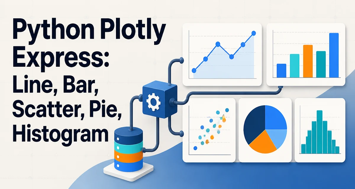
When you need to produce line, bar, scatter, pie, and histogram charts in Python, Plotly Express provides a concise API that turns a pandas DataFrame into an interactive figure with a single function call. The python plotly express line bar scatter pie and histogram workflow covers the most common chart types used in data exploration and reporting. Instead of manually building traces with plotly.graph_objects, Express abstracts the boilerplate and lets you focus on the data mapping.
Why Plotly Express for Common Chart Types
Plotly Express is designed for rapid iteration. Each chart function accepts a DataFrame and maps columns to visual channels like x, y, color, size, and facet. The resulting figure is an interactive HTML object that supports zooming, hovering, and exporting to static images. For developers who need to inspect data quickly or embed charts in web dashboards, Express reduces the code required by roughly half compared to graph_objects.
The key distinction is that Express operates on tidy data: each row is an observation, each column is a variable. This aligns with how most data is stored in pandas, so you rarely need to reshape your data before plotting. If your data is already in a DataFrame, the chart functions become one-liners.
Line Charts with plotly.express.line
A line chart is appropriate when you want to show a trend over a continuous variable, typically time. The line function maps x to the independent axis and y to the dependent variable. If you pass multiple columns to y, each becomes a separate line.
import plotly.express as px
import pandas as pd

df = pd.DataFrame({
    "date": pd.date_range("2024-01-01", periods=12, freq="ME"),
    "sales": [120, 135, 142, 158, 162, 175, 190, 205, 210, 230, 245, 260]
})

fig = px.line(df, x="date", y="sales", title="Monthly Sales Trend")
fig.show()
When your data has a categorical column that splits the lines, use color to create a grouped line chart. For example, if you have sales per region, pass color="region" and each region gets its own line with a legend. The markers parameter adds point markers, which is useful when the data is sparse or you want to highlight individual observations.
One common mistake is using a line chart when the x values are not ordered. Plotly will still connect points in the order they appear in the DataFrame, which can produce misleading zigzags. Sort the DataFrame by x before plotting if the natural order matters.
Bar Charts with plotly.express.bar
Bar charts compare categorical values or show a distribution across discrete bins. The bar function works similarly to line but draws rectangular bars. For a simple count of categories, you can pass a single column to x and omit y; Plotly will count occurrences.
import plotly.express as px

df = px.data.tips()  # built-in dataset
fig = px.bar(df, x="day", y="total_bill", color="sex", barmode="group",
             title="Total Bill by Day and Sex")
fig.show()
The barmode parameter controls how bars from different color groups appear. Use "group" for side-by-side bars, "stack" for stacked bars, and "overlay" for overlapping bars with transparency. When you need a horizontal bar chart, swap x and y or set orientation="h".
Bar charts can also represent aggregated values. If your data has multiple rows per category, you can pre-aggregate with pandas or use the histfunc parameter in the histogram function. For a bar chart that shows a mean, sum, or count, you often need to aggregate the DataFrame first using groupby and then pass the aggregated result to bar.
Scatter Plots with plotly.express.scatter
Scatter plots reveal relationships between two continuous variables. The scatter function maps x and y to the axes, and you can encode additional dimensions with color, size, and symbol. This makes it easy to spot clusters, outliers, or trends.
import plotly.express as px

df = px.data.iris()
fig = px.scatter(df, x="sepal_width", y="sepal_length", color="species",
                 size="petal_length", hover_data=["petal_width"])
fig.show()
The size parameter scales the marker area, which is useful for representing a third numeric variable. hover_data adds extra columns to the tooltip without affecting the visual encoding. For large datasets, consider using opacity to reduce overplotting, or use marginal_x and marginal_y to add histograms along the axes.
When the dataset is very large, the default scatter plot may render thousands of overlapping points, making it hard to read. Plotly Express does not automatically downsample. You can either aggregate the data into bins or switch to a density heatmap using px.density_heatmap if the relationship is better shown as a distribution.
Pie Charts with plotly.express.pie
Pie charts display the proportion of a whole across categories. The pie function takes names for the category labels and values for the numeric sizes. If you omit values, it counts the occurrences of each category.
import plotly.express as px

df = px.data.tips()
fig = px.pie(df, names="day", values="total_bill", title="Share of Total Bill by Day")
fig.show()
Pie charts are most effective when you have a small number of categories, typically fewer than six. Too many slices make the chart cluttered and the proportions hard to compare. For more than a few categories, a bar chart is usually a better choice. You can pull a slice out by setting pull to a list of fractions, and you can control the hole size with hole to create a donut chart.
One limitation of pie charts is that they do not handle negative values well. If your data contains negative numbers, the chart will still render but the proportions become misleading. Consider using a bar chart or a stacked bar chart instead.
Histograms with plotly.express.histogram
A histogram shows the distribution of a numeric variable by dividing it into bins and counting the frequency. The histogram function takes a single column as x (or y for horizontal orientation) and automatically computes the bins.
import plotly.express as px

df = px.data.tips()
fig = px.histogram(df, x="total_bill", nbins=30, color="sex",
                   marginal="box", title="Distribution of Total Bill")
fig.show()
The nbins parameter controls the number of bins. If you omit it, Plotly uses a default heuristic based on the data range and sample size. You can also set histnorm to "percent" or "density" to normalize the counts. The marginal parameter adds a rug plot, box plot, or violin plot below the histogram to show the raw data points.
When you pass a color column, the histogram creates overlaid bars for each category. By default, they are stacked. You can set barmode="overlay" with opacity to make them transparent and compare distributions side by side. For a cumulative distribution, set cumulative=True.
Histograms are sensitive to bin width. A bin width that is too large hides the shape of the distribution, while one that is too small creates noise. The default nbins often works well, but for publication-quality charts you may need to experiment with the nbins or use bins to specify a custom binning scheme.
Customizing Layout and Traces
Every Express figure returns a go.Figure object, so you can update any aspect of the layout or traces after creation. Use the update_layout method to set titles, axis labels, font sizes, and margins. Use update_traces to change marker colors, line widths, or hover templates.
fig.update_layout(
    title="Customized Chart",
    xaxis_title="X Axis",
    yaxis_title="Y Axis",
    template="plotly_white",
    legend_title="Legend"
)
fig.update_traces(marker=dict(size=8, line=dict(width=1, color="black")))
The template parameter accepts built-in themes like "plotly", "plotly_white", "seaborn", or "ggplot2". You can also define a custom template if you need consistent branding across multiple charts. The labels parameter in the original Express call provides a convenient way to rename columns for display without modifying the DataFrame.
For web embedding, you can write the figure to an HTML file with fig.write_html(), or convert it to a static image with fig.write_image() if you have the kaleido package installed. The interactive features remain active in the HTML version, which is useful for dashboards or Jupyter notebooks.
Data Handling and Performance Considerations
Plotly Express is optimized for interactive exploration with datasets up to a few hundred thousand points. Beyond that, rendering becomes sluggish because every point is drawn as a separate SVG or WebGL element. For large datasets, consider aggregating the data before plotting. For example, you can use pandas groupby to compute summary statistics and then plot the aggregated result.
Another option is to use plotly.graph_objects with scattergl for WebGL rendering, which handles larger point counts better than the standard SVG renderer. However, Express does not expose scattergl directly. If you need to plot millions of points, you should either downsample or switch to a different visualization library designed for big data.
Memory usage is also a consideration. Express figures store the entire data in the figure object. If your DataFrame has many columns, only the columns you map to visual channels are included in the figure. You can reduce memory by selecting only the necessary columns before calling the chart function. Additionally, when you save a figure to HTML, the data is embedded as JSON, so a large dataset can produce a very large file. For production dashboards, consider using a server-side rendering approach with Dash or sending only aggregated data to the client.
Finally, be aware that Express functions require a pandas DataFrame. If your data is in a NumPy array or a list, you need to convert it to a DataFrame first. This is a minor overhead but can be avoided by keeping data in a tabular format from the start.