Python Plotly Graph Objects: Multiple Traces and Subplots
python plotly graph objects multiple traces and subplots: Learn how to build complex figures with multiple traces and subplots using Plotly graph objects in Python, in...
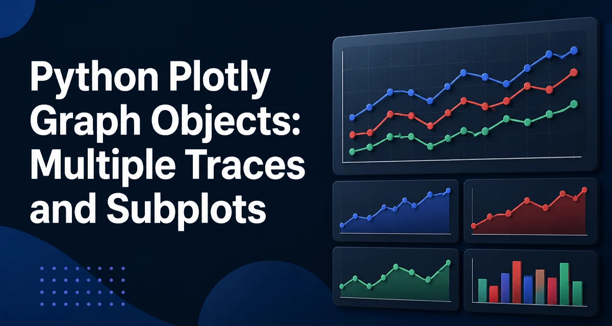
python plotly graph objects multiple traces and subplots requires a clear understanding of the core syntax, runtime behavior, and practical implementation patterns demonstrated in the examples below.
When a single Plotly figure needs to show several series or several related charts, the plotly.graph_objects module provides the building blocks. Combining multiple traces and subplots in Python with Plotly graph objects requires understanding how go.Figure holds traces and how make_subplots creates the layout that places those traces in separate panels.
Plotly Graph Objects and Traces
The plotly.graph_objects module (commonly imported as go) exposes a declarative API. A go.Figure is the top-level container. Traces, such as go.Scatter, go.Bar, or go.Heatmap, are added to a figure with the add_trace method. Each trace carries its own data and visual properties.
import plotly.graph_objects as go

fig = go.Figure()
fig.add_trace(go.Scatter(x=[1, 2, 3], y=[4, 5, 6], mode='lines', name='series A'))
fig.add_trace(go.Scatter(x=[1, 2, 3], y=[6, 5, 4], mode='lines', name='series B'))
This figure contains two traces on a single set of axes. When you call fig.show(), both traces are rendered on the same plot. The name parameter controls the legend entry. If you omit name, Plotly generates a default label.
Traces are not limited to line charts. You can mix trace types in the same figure, such as a scatter trace and a bar trace, as long as the axes are compatible. This is often used to overlay raw data points on a bar chart or to combine a line forecast with historical bars.
Creating Subplots with make_subplots
To place traces in separate panels, you need a figure with multiple axes. The make_subplots function from plotly.subplots creates a grid of subplots and returns a go.Figure with the appropriate axis objects.
from plotly.subplots import make_subplots

fig = make_subplots(rows=2, cols=2)
This creates a 2x2 grid. Each cell has its own x and y axis. The returned figure is a go.Figure, so you can still add traces with add_trace. But now each trace must specify which subplot it belongs to.
make_subplots accepts several parameters that affect the layout. The specs parameter controls the type of each subplot, such as {'type': 'scatter'} or {'type': 'bar'}. The shared_xaxes and shared_yaxes options link axes across rows or columns, which helps when comparing trends. The subplot_titles parameter adds a title to each panel.
fig = make_subplots(
    rows=2, cols=2,
    subplot_titles=('Sales', 'Margin', 'Traffic', 'Conversion'),
    shared_xaxes=True,
    vertical_spacing=0.1
)
vertical_spacing and horizontal_spacing control the gap between subplots. These are fractions of the figure height or width, so values between 0 and 1 are expected.
Adding Traces to Specific Subplots
When a figure contains subplots, add_trace requires the row and col arguments to place the trace in the correct panel. These are 1-indexed, matching the rows and cols passed to make_subplots.
import plotly.graph_objects as go
from plotly.subplots import make_subplots

fig = make_subplots(rows=2, cols=2)

fig.add_trace(go.Scatter(x=[1, 2, 3], y=[2, 3, 5], mode='lines', name='Revenue'), row=1, col=1)
fig.add_trace(go.Bar(x=['A', 'B', 'C'], y=[10, 20, 15], name='Count'), row=1, col=2)
fig.add_trace(go.Scatter(x=[1, 2, 3], y=[0.1, 0.2, 0.3], mode='lines', name='Rate'), row=2, col=1)
fig.add_trace(go.Scatter(x=[1, 2, 3], y=[30, 25, 40], mode='markers', name='Volume'), row=2, col=2)
If you omit row and col, Plotly raises an error when the figure has multiple subplots, because it cannot infer the target axes. The error message is explicit: add_trace requires the row and col arguments when the figure contains subplots.
You can also add multiple traces to the same subplot by passing the same row and col values. This is common when you want to overlay two series in one panel.
Combining Multiple Traces in One Subplot
A subplot does not have to contain only one trace. You can add as many traces as needed to a single panel, as long as they share the same axis domain. For example, a line trace and a scatter trace can coexist in the same subplot to show a trend and its raw observations.
fig = make_subplots(rows=1, cols=1)

fig.add_trace(go.Scatter(x=[1, 2, 3], y=[2, 4, 6], mode='lines', name='Trend'), row=1, col=1)
fig.add_trace(go.Scatter(x=[1, 2, 3], y=[2.1, 3.9, 6.2], mode='markers', name='Observed'), row=1, col=1)
This works because both traces are assigned to the same subplot. The name field distinguishes them in the legend. When you have many traces in one subplot, the legend becomes essential for readability. You can control legend behavior through update_layout.
Controlling Layout and Axes
After adding traces, you typically need to adjust the overall layout. The update_layout method sets titles, legend position, and other figure-wide properties.
fig.update_layout(
    title='Quarterly Performance',
    legend_title='Metric',
    width=900,
    height=600
)
Axis titles are set per subplot using update_xaxes and update_yaxes. You can target a specific subplot with the row and col arguments, or apply a change to all subplots by omitting them.
fig.update_xaxes(title_text='Date', row=1, col=1)
fig.update_yaxes(title_text='Revenue (USD)', row=1, col=1)
When shared_xaxes=True is used, the x-axis of the top row is hidden for lower rows by default. This reduces clutter but can confuse if you expect tick labels on every panel. You can override this by setting showticklabels=True on a specific axis.
Common Pitfalls When Mixing Traces and Subplots
One frequent mistake is forgetting to pass row and col when adding a trace to a multi-subplot figure. The error is immediate, but the fix is simple. Another issue is using the same trace object in multiple subplots. If you create a trace and then add it to two different subplots, Plotly may not behave as expected because a trace object is tied to a specific set of axes. Always create a new trace instance for each subplot.
Another pitfall is mismatching the specs type. If you define a subplot as {'type': 'bar'} but then add a scatter trace, Plotly will still render it, but the axis configuration may not be optimal. For example, a bar chart expects categorical or numeric x values, and a scatter trace may introduce unexpected gaps. It is safer to use {'type': 'scatter'} or rely on the default, which allows any trace type.
Also, when using shared_xaxes, the x-axis range is synchronized across columns. This is useful for comparison, but if the data ranges differ significantly, one subplot may appear compressed. Consider whether shared axes are appropriate for your data before enabling them.
Performance Considerations for Large Data
Plotly renders traces in the browser, and the number of data points directly affects rendering time and memory usage. When you have many traces and subplots, each trace adds to the total DOM size. For large datasets, use go.Scattergl instead of go.Scatter. Scattergl uses WebGL for rendering and handles hundreds of thousands of points more smoothly than the SVG-based Scatter.
fig.add_trace(go.Scattergl(x=x_values, y=y_values, mode='lines'), row=1, col=1)
The tradeoff is that Scattergl has some limitations. It does not support all text formatting options, and certain hover behaviors differ. For most line charts with dense data, Scattergl is the better choice.
Another consideration is the number of subplots. Each subplot creates separate axes objects, and the layout engine must calculate positions for each. Keeping the grid small and using vertical_spacing and horizontal_spacing to reduce overlap helps maintain readability. If you need to display many charts, consider using a figure with a single subplot and multiple traces instead, or use a faceted chart with facet_row and facet_col in the higher-level plotly.express API, which handles grouping internally.
When you export a figure to HTML or an image, the file size grows with the number of traces and points. For production dashboards, consider downsampling or aggregating data before passing it to Plotly. This reduces the load on the client and keeps interactions responsive.