Python Plotly Heatmap and 3D Charts
python plotly heatmap and 3d charts: Learn to create interactive heatmaps and 3D charts with Python Plotly, covering plotly express, graph_objects, customization, and...
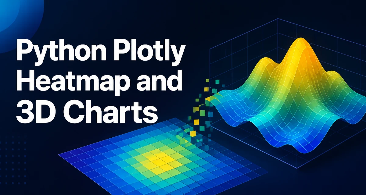
python plotly heatmap and 3d charts requires a clear understanding of the core syntax, runtime behavior, and practical implementation patterns demonstrated in the examples below.
Python Plotly provides a unified API for building interactive heatmaps and 3D charts. This article covers the two main interfaces—plotly express and graph_objects—and shows how to create, customize, and render these visualizations efficiently.
Choosing Between Plotly Express and graph_objects
Plotly offers two layers for creating figures. plotly.express (usually imported as px) is a high-level wrapper that generates complete figures from tidy data. It is concise and works well for exploratory analysis. plotly.graph_objects (imported as go) gives you fine-grained control over every trace, layout, and annotation. For heatmaps and 3D charts, both are viable; the choice depends on how much control you need.
| Aspect | plotly.express | graph_objects |
|---|---|---|
| API style | High-level, column-oriented | Low-level, trace-oriented |
| Data input | Pandas DataFrame or array-like | Arrays, lists, or DataFrames |
| Customization | Limited but sufficient for common cases | Full control over traces and layout |
| Learning curve | Shallow | Steeper |
| Best fit | Quick exploration, standard plots | Complex layouts, precise styling |
For a one-off script, px is often faster to write. For reusable chart functions or highly customized visuals, go is more flexible.
Creating a Heatmap with Plotly Express
A heatmap displays matrix values as colors. With px.imshow, you can pass a 2D array or a DataFrame. The simplest example uses a NumPy array:
import plotly.express as px
import numpy as np

matrix = np.random.rand(10, 12)
fig = px.imshow(matrix, color_continuous_scale='Viridis')
fig.show()
px.imshow infers axes from array dimensions. If you have row and column labels, pass them via x and y parameters. For a correlation matrix, you often want to display the actual values. Use text_auto=True to show numbers inside cells:
import pandas as pd

df = pd.DataFrame(np.random.randn(5, 5), columns=list('ABCDE'))
fig = px.imshow(df, text_auto=True, aspect='auto')
fig.show()
The aspect parameter controls cell aspect ratio. 'auto' lets the plot size adapt to the figure dimensions, which is useful when rows and columns have different scales.
Customizing Heatmap Colors and Annotations
Color scales are central to heatmap readability. Plotly includes many built-in scales like 'Viridis', 'Plasma', and 'RdBu'. For diverging data (e.g., correlation coefficients), a diverging scale with a neutral midpoint is appropriate:
fig = px.imshow(corr_matrix, color_continuous_scale='RdBu', zmin=-1, zmax=1)
Setting zmin and zmax ensures the color mapping is consistent across multiple plots. If you need a custom color scale, define it as a list of tuples:
custom_scale = [(0, 'darkblue'), (0.5, 'white'), (1, 'darkred')]
fig = px.imshow(matrix, color_continuous_scale=custom_scale)
Annotations can be added via text_auto or by passing a text matrix. For large matrices, displaying every value clutters the plot. In that case, consider using hovertemplate to show values only on hover:
fig = px.imshow(matrix, color_continuous_scale='Blues')
fig.update_traces(hovertemplate='Row: %{y}<br>Column: %{x}<br>Value: %{z:.2f}<extra></extra>')
Using graph_objects for Heatmaps
When you need more control, go.Heatmap is the underlying trace. This is useful when combining a heatmap with other traces or when you need to adjust the colorbar position independently.
import plotly.graph_objects as go

fig = go.Figure(data=go.Heatmap(
    z=matrix,
    colorscale='Viridis',
    colorbar=dict(title='Value', thickness=15)
))
fig.update_layout(title='Heatmap with graph_objects')
go.Heatmap accepts x, y, and z arrays directly. You can also use zmin and zmax to control the color scale range. To add text labels, set text and texttemplate:
text_matrix = np.round(matrix, 2)
fig = go.Figure(data=go.Heatmap(
    z=matrix,
    text=text_matrix,
    texttemplate='%{text}',
    textfont={'size': 10}
))
This approach is more verbose but allows you to mix heatmaps with scatter traces in the same figure, which is often needed in dashboards.
Building 3D Surface Plots
3D surface charts represent a function z = f(x, y). Plotly's go.Surface trace expects x, y, and z as 2D arrays or a single z matrix with optional x and y vectors. For example:
def f(x, y):
    return np.sin(np.sqrt(x**2 + y**2))

x = np.linspace(-5, 5, 50)
y = np.linspace(-5, 5, 50)
X, Y = np.meshgrid(x, y)
Z = f(X, Y)

fig = go.Figure(data=[go.Surface(z=Z, x=x, y=y, colorscale='Viridis')])
fig.update_layout(scene=dict(xaxis_title='X', yaxis_title='Y', zaxis_title='Z'))
go.Surface automatically adds a colorbar. You can control the surface's lighting and contours with lighting and contours parameters. For example, to add contour lines on the surface:
fig = go.Figure(data=[go.Surface(
    z=Z, x=x, y=y,
    contours={
        'z': {'show': True, 'usecolormap': True, 'highlightcolor': 'limegreen'}
    }
)])
For data that is not on a regular grid, you can use go.Mesh3d or go.Trisurf (if available). However, go.Surface is the most common for scientific and engineering data.
Creating 3D Scatter Plots
3D scatter plots are useful for visualizing points in three dimensions. px.scatter_3d is the express version:
df = px.data.iris()
fig = px.scatter_3d(df, x='sepal_length', y='sepal_width', z='petal_length',
                    color='species', size='petal_width')
fig.show()
The color and size parameters map data columns to visual attributes. With go.Scatter3d, you have more control over marker style and hover text:
fig = go.Figure(data=[go.Scatter3d(
    x=df['sepal_length'], y=df['sepal_width'], z=df['petal_length'],
    mode='markers',
    marker=dict(size=5, color=df['petal_width'], colorscale='Viridis', showscale=True)
)])
When the number of points is large, consider reducing marker size and disabling the colorbar if it is not needed. 3D rendering is more expensive than 2D, so performance becomes a concern with tens of thousands of points.
Performance Considerations for Large Data
Plotly figures are client-side rendered, meaning the browser handles drawing. Large datasets can cause sluggish interaction. For heatmaps, a 1000x1000 matrix is generally fine, but a 5000x5000 matrix may be slow. For 3D surfaces, the number of grid points directly affects rendering time. A common strategy is to downsample the data before plotting. For example, using scipy.ndimage.zoom or simply slicing the array:
# Downsample a matrix by taking every nth element
step = 2
matrix_downsampled = matrix[::step, ::step]
For 3D scatter plots, you can use plotly.express.scatter_3d with a sample of the DataFrame:
sample = df.sample(n=5000, random_state=1)
fig = px.scatter_3d(sample, x='x', y='y', z='z')
Another approach is to use go.Scattergl for 2D scatter plots, but for 3D there is no WebGL fallback in Plotly's Python API as of version 5.x. If you need to visualize millions of points, consider using a dedicated library like datashader to rasterize the data before passing it to Plotly.
Interactivity and Export
Plotly figures are interactive by default: zooming, panning, and hovering are built in. You can further customize the behavior with update_layout and config parameters. For example, to hide the mode bar and disable zoom on the scroll wheel:
fig.show(config={'displayModeBar': False, 'scrollZoom': False})
To export a static image, use fig.write_image('plot.png'). This requires the kaleido package. For a vector format, use fig.write_image('plot.svg'). When exporting 3D charts, the camera angle is captured from the current view; set it explicitly to ensure a consistent output:
fig.update_layout(scene_camera=dict(eye=dict(x=1.5, y=1.5, z=1.5)))
fig.write_image('surface.png')
If you are embedding charts in a web application, fig.to_html() returns an HTML string that can be served directly. For Dash apps, you can pass the figure object to dcc.Graph. Keep in mind that large figures increase the HTML size and page load time, so apply the same downsampling strategies mentioned earlier.
Handling Categorical Axes in Heatmaps
Heatmaps often use categorical row and column labels. Plotly treats string labels as categories, but the order is determined by the input. To enforce a specific order, pass the categories explicitly:
categories = ['low', 'medium', 'high']
fig = px.imshow(matrix, x=categories, y=categories, aspect='auto')
If your data is already in a DataFrame with a categorical index, you can use df.columns and df.index directly. When using go.Heatmap, you must pass x and y as lists of labels; Plotly will map them to integer positions internally. This is important when you want to add custom tick text or adjust spacing.
For a matrix with missing values, Plotly renders them as transparent by default. You can set zmin and zmax to control the color scale, but missing values remain blank. If you want to treat missing values as a specific color, use colorscale with a special value or preprocess the data to fill NaN with a sentinel.
Combining Heatmaps and 3D Charts in a Single Figure
Plotly allows subplots with different chart types using make_subplots. You can place a heatmap and a 3D surface side by side, though mixing 2D and 3D axes in the same figure requires careful layout. A common pattern is to use specs to define different types:
from plotly.subplots import make_subplots

fig = make_subplots(
    rows=1, cols=2,
    specs=[[{'type': 'heatmap'}, {'type': 'surface'}]]
)

fig.add_trace(go.Heatmap(z=matrix), row=1, col=1)
fig.add_trace(go.Surface(z=Z), row=1, col=2)
This approach works but the 3D plot will have its own camera controls. When sharing data between the two, consider linking hover events using plotly's event system, though that requires a Dash application. For static exports, ensure both subplots have appropriate aspect ratios to avoid distortion.
Debugging Common Plotly Issues
Two frequent issues appear when working with heatmaps and 3D charts. First, px.imshow expects a 2D array; passing a 3D array (e.g., an RGB image) will raise an error. Use z as a 2D matrix or switch to go.Image for images. Second, 3D surface plots with NaN values can render incorrectly. Plotly does not handle NaN in z gracefully; you may see holes or artifacts. Preprocess your data to fill or interpolate missing values before plotting.
Another issue is the colorbar range shifting when you update data dynamically. Always set zmin and zmax explicitly if the data range is known in advance. For 3D scatter plots, the marker size is in pixels, not data units; if you map a column to size, the scaling may be non-linear. Use sizeref to control the scaling factor.
Finally, remember that Plotly figures are not designed to be edited after creation. If you need to modify a trace's data, create a new figure or use fig.data[0].z = new_z followed by fig.update_traces(). This is more efficient than recreating the entire figure from scratch.