Python Seaborn Histogram, KDE, Box, and Violin Plots
python seaborn histogram kde box and violin plots: Learn to create and interpret seaborn histograms, KDE plots, box plots, and violin plots for effective distribution...
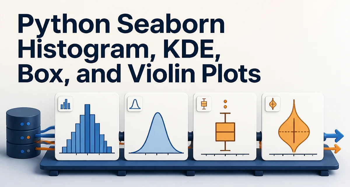
python seaborn histogram kde box and violin plots requires a clear understanding of the core syntax, runtime behavior, and practical implementation patterns demonstrated in the examples below.
When you need to understand how a numeric variable is distributed, seaborn provides four primary plot types: histograms, kernel density estimates (KDE), box plots, and violin plots. Each encodes the distribution differently, and the right choice depends on the number of observations, the need to compare groups, and the level of detail required. This article walks through the seaborn API for each plot, shows how to combine them, and explains the tradeoffs so you can pick the right tool for your data.
Understanding the Four Plot Types
Seaborn builds on Matplotlib and offers high-level functions that handle aggregation and statistical transformation for you. The four plot types you're most likely to need are:
- Histogram: Discretizes the data into bins and counts observations per bin. It gives a raw, empirical view of the distribution's shape.
- KDE plot: Estimates a smooth probability density function from the data. It's useful for seeing the underlying distribution without being sensitive to bin width.
- Box plot: Summarizes the distribution using quartiles, median, and outliers. It's compact and ideal for comparing many groups side by side.
- Violin plot: Combines a box plot with a KDE, showing the full density shape while also displaying quartile information. It's more informative than a box plot but can become cluttered with many groups.
All four can be generated with a single seaborn function call, but they serve different analytical purposes. The rest of this article shows the exact syntax and discusses when each is appropriate.
Creating Histograms and KDE Plots with histplot
Seaborn's histplot function can produce both a histogram and a KDE overlay. The most basic histogram looks like this:
import seaborn as sns
import matplotlib.pyplot as plt

df = sns.load_dataset("penguins")
sns.histplot(data=df, x="flipper_length_mm")
plt.show()
By default, histplot chooses the bin width automatically. You can control it with the bins parameter, either as an integer or a sequence. To add a KDE curve on top of the histogram, set kde=True:
sns.histplot(data=df, x="flipper_length_mm", kde=True)
The KDE is estimated using Gaussian kernels with a bandwidth that seaborn selects via Scott's rule or Silverman's rule, depending on the data size. You can adjust the bandwidth with the bw_adjust parameter inside kde_kws:
sns.histplot(data=df, x="flipper_length_mm", kde=True, kde_kws={"bw_adjust": 0.5})
A smaller bw_adjust makes the KDE follow the data more closely, potentially showing noise; a larger value smooths it more. If you want only the KDE without the histogram, use kdeplot directly:
sns.kdeplot(data=df, x="flipper_length_mm")
kdeplot is a separate function that gives you finer control over the KDE estimation and can also handle weighted data.
Creating Box Plots with boxplot
A box plot summarizes the distribution through five numbers: minimum (excluding outliers), first quartile (Q1), median, third quartile (Q3), and maximum (excluding outliers). Outliers are plotted as individual points. The basic seaborn box plot is:
sns.boxplot(data=df, x="species", y="flipper_length_mm")
This creates a separate box for each species, making group comparisons straightforward. The box spans the interquartile range (IQR), the line inside is the median, and the whiskers extend to 1.5 * IQR beyond the quartiles. Points beyond that are considered outliers and shown individually.
Box plots are compact and work well when you have many categories. They don't show multimodality (multiple peaks) in the data, but they give a clear summary of location and spread. You can also use hue to split groups further:
sns.boxplot(data=df, x="species", y="flipper_length_mm", hue="sex")
This adds a second dimension of grouping, which is useful when you want to compare distributions across two categorical variables.
Creating Violin Plots with violinplot
A violin plot combines the box plot's summary statistics with a KDE of the full distribution. The width of the violin at any value represents the estimated density of observations at that value. The basic call is:
sns.violinplot(data=df, x="species", y="flipper_length_mm")
Inside each violin, a miniature box plot shows the median and IQR. By default, the box plot is drawn with a thin line. You can disable it with inner=None if you only want the density shape. Violin plots are particularly good at revealing multimodal distributions because the density can show multiple bumps that a box plot would hide.
However, violin plots become harder to read when you have many categories or when the sample size per group is small. The KDE can over-smooth and give a misleading impression of density. In such cases, a box plot or a simple histogram might be more honest.
Comparing Distributions: When to Use Which Plot
The choice among these four plot types depends on what you need to communicate and the structure of your data.
| Plot Type | Best For | Limitations |
|---|---|---|
| Histogram | Raw counts, binning, exact frequencies | Sensitive to bin width, can hide shape |
| KDE | Smooth density, comparing multiple groups | Bandwidth choice, can over-smooth |
| Box plot | Compact summary, many groups, outlier detection | Hides multimodality, loses detail |
| Violin plot | Full distribution, multimodality, group comparison | Can be cluttered, over-smooths with small n |
Use a histogram when you need to know exact counts or when the audience is familiar with bin-based representations. Use a KDE when you want to compare the shape of distributions across groups without the distraction of bin edges. Use a box plot when you have many categories and only need a robust summary of location and spread. Use a violin plot when you suspect multimodality and want to show the full density while still providing quartile information.
Combining Plots: Overlaying KDE on Histogram
One of the most common patterns is to overlay a KDE curve on a histogram to get both the empirical counts and a smooth density estimate. As shown earlier, histplot supports this directly with kde=True. But you can also combine histplot and kdeplot manually for more control:
sns.histplot(data=df, x="flipper_length_mm", stat="density", alpha=0.5)
sns.kdeplot(data=df, x="flipper_length_mm", color="red")
Notice that the histogram uses stat="density" so that its y-axis matches the KDE's probability density scale. If you leave the histogram in count mode, the y-axes will be different, and the KDE will be visually flattened. Using stat="density" ensures the two layers are comparable.
You can also use stat="probability" to normalize the histogram so that the sum of bar heights equals 1. This is useful when comparing distributions with different sample sizes, though the KDE still needs to be on the same scale.
Handling Multiple Groups and Faceting
When you have several groups, you can either draw them on the same axes or use seaborn's faceting to create separate subplots. For histograms and KDEs, you can use hue to color by group:
sns.histplot(data=df, x="flipper_length_mm", hue="species", kde=True)
This draws overlapping histograms, which can become cluttered if groups overlap heavily. In that case, you can use multiple="stack" or multiple="fill" to stack or normalize the bars. For KDEs, multiple="fill" is also available and creates a stacked density plot.
For box and violin plots, hue works as shown earlier. If you need to separate plots entirely, use FacetGrid or displot:
sns.displot(data=df, x="flipper_length_mm", col="species", kind="hist", kde=True)
displot is a figure-level function that can produce histograms, KDEs, and ECDFs across facets. It returns a FacetGrid that you can further customize. This approach is cleaner when you want to compare each group in its own panel rather than overlapping them.
Performance and Data Size Considerations
The computational cost of these plots scales differently with data size. Histograms are fast because they only require binning and counting. KDEs are more expensive because they evaluate a kernel function at many points; the default gridsize is 200, but the underlying computation is O(n * m) where n is the number of data points and m is the number of grid points. For very large datasets (millions of rows), KDE can become noticeably slow. You can reduce the gridsize parameter in kdeplot to speed it up at the cost of resolution.
Box plots are also efficient because they only need to compute quartiles and outliers, which can be done with a single pass over sorted data. Violin plots are the most expensive because they compute a KDE for each group. If you have many groups or a huge dataset, violin plots can take significantly longer to render. In such cases, consider using a box plot or a histogram with hue instead.
Memory usage is another factor. Seaborn creates a new figure and axes for each plot, and the underlying Matplotlib objects hold references to the data. If you're generating many plots in a loop, be sure to close figures with plt.close() to free memory, especially in long-running scripts or Jupyter notebooks.
Common Pitfalls and How to Avoid Them
One common mistake is forgetting to normalize the histogram when overlaying a KDE. As mentioned, use stat="density" or stat="probability" to align the y-axes.
Another pitfall is using hue with histplot and kde=True without setting multiple. The default behavior is to draw overlapping bars, which can obscure the distribution. Set multiple="stack" or multiple="fill" to make the plot readable.
When using violinplot, be aware that the KDE bandwidth is chosen automatically and might not reflect the true density if your data has sharp peaks or heavy tails. You can pass bw_adjust to violinplot via the inner parameter? Actually, violinplot does not expose bw_adjust directly. To control the KDE inside a violin plot, you need to use kdeplot manually or accept the default. If you need precise control over the KDE, consider using kdeplot with cut=0 to avoid extending beyond the data range.
Finally, remember that seaborn's functions return a Axes object (or a FacetGrid for figure-level functions). You can use that object to add annotations, change limits, or combine with other Matplotlib elements. For example, after creating a box plot, you can add a strip plot on top to show individual data points:
ax = sns.boxplot(data=df, x="species", y="flipper_length_mm")
sns.stripplot(data=df, x="species", y="flipper_length_mm", ax=ax, color="black", alpha=0.5)
This combination is useful for small datasets where you want to see both the summary and the raw observations.
Seaborn's distribution plots are powerful tools for exploratory data analysis, but they are only as useful as the choices you make about binning, bandwidth, and normalization. By understanding the underlying mechanics of each plot type, you can select the one that communicates your data's story accurately and efficiently.