Python Seaborn Line, Bar, Scatter, and Count Plots
python seaborn line bar scatter and count plots: Learn to create line, bar, scatter, and count plots with seaborn, including syntax, parameters, and when to use each t...
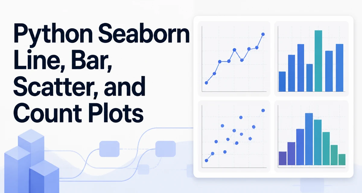
python seaborn line bar scatter and count plots requires a clear understanding of the core syntax, runtime behavior, and practical implementation patterns demonstrated in the examples below.
When you need to explore relationships, distributions, and counts in a dataset, seaborn provides four core plotting functions: lineplot, barplot, scatterplot, and countplot. These cover the most common visualizations for continuous and categorical data. This article walks through each function's syntax, key parameters, and typical use cases, then shows how to customize the output and choose the right plot for your data.
Line Plots with sns.lineplot
lineplot is used to visualize the relationship between two continuous variables, often across a time or ordered sequence. It draws a line connecting data points and can also aggregate multiple observations at each x value by showing the mean and a confidence band.
import seaborn as sns
import matplotlib.pyplot as plt

df = sns.load_dataset("flights")
sns.lineplot(data=df, x="year", y="passengers")
plt.show()
The data parameter accepts a pandas DataFrame. The x and y parameters can be column names or vectors. When the same x value appears multiple times, seaborn aggregates the y values by default using the mean and draws a 95% confidence interval. You can disable this with estimator=None to plot raw points, or change the aggregation with estimator="sum" or a custom function.
For time series, you often want to plot multiple series. Use the hue parameter to color lines by a categorical column:
sns.lineplot(data=df, x="year", y="passengers", hue="month")
This creates one line per month, each with its own color. The style parameter can also map a categorical variable to line styles (solid, dashed, etc.).
Bar Plots with sns.barplot
barplot displays the relationship between a categorical variable and a continuous variable. It computes the mean (or another estimator) of the continuous variable for each category and draws a bar for each. Error bars represent the uncertainty of the estimate.
tips = sns.load_dataset("tips")
sns.barplot(data=tips, x="day", y="total_bill")
plt.show()
By default, the estimator is the mean and the error bars show a 95% confidence interval. You can change the estimator with estimator="median" or a custom function. The ci parameter controls the size of the confidence interval; set ci=None to remove error bars entirely.
To compare across a second categorical variable, use hue:
sns.barplot(data=tips, x="day", y="total_bill", hue="sex")
This creates grouped bars for each combination of day and sex. If you want to see the raw data points overlaid on the bars, you can combine barplot with stripplot or use sns.boxplot instead, depending on the level of detail you need.
Scatter Plots with sns.scatterplot
scatterplot is the go-to function for visualizing the relationship between two continuous variables. Each point represents an observation, and you can encode additional dimensions using color, size, and style.
sns.scatterplot(data=tips, x="total_bill", y="tip")
plt.show()
The hue parameter colors points by a categorical variable, size maps a continuous or categorical variable to point size, and style maps a categorical variable to different markers. For example:
sns.scatterplot(data=tips, x="total_bill", y="tip", hue="time", size="size", style="sex")
This creates a scatter plot where the color indicates lunch or dinner, the point size reflects the party size, and the marker shape indicates the sex of the bill payer. When using size with a continuous variable, seaborn scales the point areas proportionally. You can control the range with sizes=(20, 200).
For large datasets, scatterplots can suffer from overplotting. Consider using sns.kdeplot or sns.hexbin for bivariate density, or set alpha to a low value to make overlapping points transparent.
Count Plots with sns.countplot
countplot is a specialized bar plot that shows the count of observations in each category of a categorical variable. It does not require a y variable; it simply counts occurrences.
titanic = sns.load_dataset("titanic")
sns.countplot(data=titanic, x="class")
plt.show()
You can also use y instead of x to create horizontal bars. The hue parameter allows grouping by another categorical variable:
sns.countplot(data=titanic, x="class", hue="survived")
This shows the count of survivors and non-survivors in each passenger class. To control the order of categories, pass a list to the order parameter:
sns.countplot(data=titanic, x="class", order=["First", "Second", "Third"])
If you need to show proportions instead of raw counts, you can normalize the data before plotting or use stat="proportion" (available in seaborn 0.13 and later). For older versions, you can compute proportions manually and use barplot.
Customizing Seaborn Plots
Seaborn integrates with matplotlib, so you can customize every aspect of a plot using matplotlib functions. Common adjustments include figure size, titles, axis labels, and legend placement.
plt.figure(figsize=(10, 6))
sns.lineplot(data=df, x="year", y="passengers")
plt.title("Passengers Over Time")
plt.xlabel("Year")
plt.ylabel("Number of Passengers")
plt.legend(title="Month")
plt.show()
You can also set the overall style with sns.set_theme(). This function controls the background grid, font, and color palette. For example:
sns.set_theme(style="whitegrid", palette="muted")
This gives a clean look with a white background and subtle grid lines. The palette parameter accepts any matplotlib colormap or a list of colors. For categorical palettes, sns.color_palette("husl") provides a set of distinct colors.
When you need to save a figure, use plt.savefig() before plt.show():
plt.savefig("plot.png", dpi=300, bbox_inches="tight")
This ensures the output is high-resolution and includes all labels and legends.
Choosing the Right Plot for Your Data
Selecting the correct plot type depends on the nature of your data and the question you are trying to answer.
- Use
lineplotwhen you have a continuous x variable and want to show trends, especially over time or an ordered sequence. It is also useful for showing multiple series withhue. - Use
barplotwhen you have a categorical x variable and a continuous y variable, and you want to compare the central tendency (mean, median) across categories. It is also useful for showing uncertainty with error bars. - Use
scatterplotwhen both variables are continuous and you want to examine the relationship, correlation, or clustering. It is the starting point for regression analysis. - Use
countplotwhen you have one or two categorical variables and you want to show the frequency of each category. It is the simplest way to visualize a distribution of counts.
These are not exclusive. For example, you might overlay a scatterplot with a regression line using sns.regplot, or combine a countplot with a barplot to show both counts and a numeric value. The key is to match the plot to the data types and the insight you need.
Common Pitfalls and How to Avoid Them
One common mistake is passing a list or array directly without specifying data. Seaborn functions expect a DataFrame and column names for x and y. If you pass raw arrays, you must use the data parameter or the function will error. Always use data=df and refer to columns by name.
Another issue is missing values. Seaborn handles NaN by dropping those observations, but if you have many missing values, the plot may become misleading. Check your data with df.isna().sum() before plotting.
For countplot, the order parameter is essential when you want a consistent category order across multiple plots. Without it, seaborn sorts categories alphabetically, which may not match your intended sequence.
When using hue, be aware that the legend can become crowded if there are many categories. You can adjust the legend position and size with plt.legend(bbox_to_anchor=(1.05, 1), loc='upper left') or remove it entirely with legend=False.
Finally, remember that seaborn is built on matplotlib. If you need fine-grained control over elements like tick marks or annotations, you can always access the underlying matplotlib axes object. This is especially useful when you need to add custom text or shapes to a plot.
Handling Large Datasets with Seaborn
Seaborn is designed for exploratory data analysis, not for rendering millions of points. When working with large datasets, scatterplots and lineplots can become slow and unreadable. For scatterplots, consider downsampling your data or using sns.kdeplot with fill=True to show density. For lineplots, you can aggregate the data first using pandas groupby and then plot the aggregated means.
Another option is to use sns.relplot with kind="scatter" or kind="line" to create faceted plots that split the data into smaller subsets. This keeps each subplot manageable and allows you to compare patterns across groups without overplotting.
If performance becomes a bottleneck, you can switch to matplotlib's plot and scatter functions directly, which have lower overhead. However, you lose seaborn's automatic aggregation and confidence intervals. For truly large data, consider using a plotting library that leverages GPU rendering, such as plotly or datashader, but be aware that these require additional setup.