python seaborn vs matplotlib: Which to Use?
python seaborn vs matplotlib: Compare Python's two main plotting libraries: Matplotlib's low-level control versus Seaborn's statistical convenience. Learn when to use...
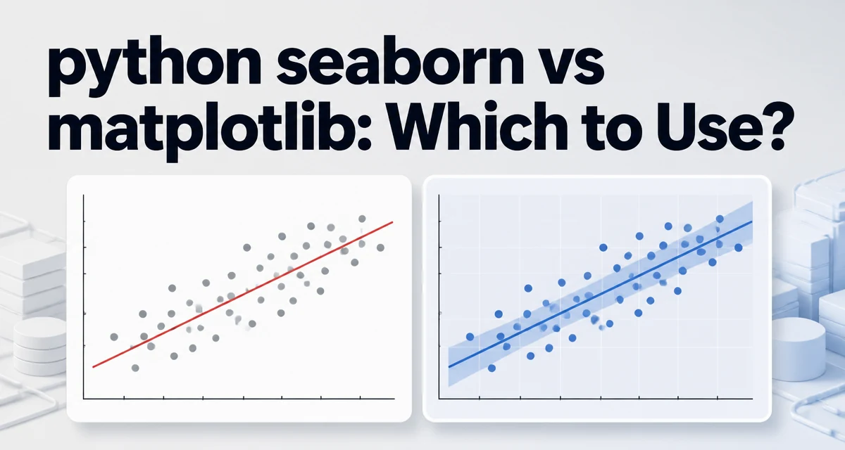
Choosing between python seaborn vs matplotlib for a new visualization task often comes down to how much control you need versus how quickly you want a statistically meaningful plot. Matplotlib gives you a low-level drawing API, while Seaborn wraps Matplotlib with higher-level functions designed for statistical exploration. Understanding the tradeoffs helps you pick the right tool without rewriting code later.
What Each Library Provides
Matplotlib is the foundational plotting library for Python. It exposes a stateful object model where you create figures and axes, then call methods to add lines, bars, scatter points, annotations, and custom shapes. Every element of a plot is accessible and modifiable, which makes Matplotlib ideal for publication-quality figures, complex layouts, and non-standard visualizations.
Seaborn is built on top of Matplotlib and targets statistical visualization. It provides functions like relplot, catplot, distplot, and regplot that automatically compute statistical summaries, fit regression lines, or aggregate data before drawing. Seaborn also ships with sensible default themes and color palettes, so a basic plot often looks polished without manual styling.
The two libraries are not competitors in the sense that you must choose only one. Seaborn uses Matplotlib under the hood, and you can always access the underlying Matplotlib axes to fine-tune a Seaborn figure. The real decision is whether you want to work at the level of individual plot components or at the level of statistical patterns.
Key Differences in API Design
The most visible difference is how you specify data. Matplotlib typically works with NumPy arrays or Python lists. You pass x and y sequences directly to plotting functions. Seaborn is designed around pandas DataFrames. You pass a DataFrame and column names as strings, and Seaborn handles grouping, aggregation, and missing data internally.
# Matplotlib: pass arrays directly
import matplotlib.pyplot as plt
import numpy as np

x = np.linspace(0, 10, 100)
y = np.sin(x)
plt.plot(x, y)
plt.show()
# Seaborn: pass DataFrame and column names
import seaborn as sns
import pandas as pd

df = pd.DataFrame({'x': x, 'y': y})
sns.lineplot(data=df, x='x', y='y')
plt.show()
Seaborn functions accept a data parameter and use string column names, which reduces boilerplate when you already have a DataFrame. They also handle categorical variables and hue grouping automatically. For example, sns.scatterplot(data=df, x='x', y='y', hue='category') splits points by the hue column without a manual loop.
Matplotlib gives you more explicit control over each artist. You can set line widths, dash patterns, markers, and z-ordering directly. Seaborn exposes some of these options through its functions, but for deep customization you often need to access the returned Axes object and call Matplotlib methods on it.
| Aspect | Matplotlib | Seaborn |
|---|---|---|
| Data input | Arrays, lists, or DataFrame columns | DataFrame columns with string names |
| Statistical helpers | None built in | Regression, distribution, aggregation |
| Default styling | Minimal, requires manual tuning | Theme-aware, polished defaults |
| Customization | Full control over every artist | High-level options plus Matplotlib access |
| Learning curve | Steeeper, more verbose | Flaster for common statistical plots |
When to Use Matplotlib
Matplotlib is the right choice when you need fine-grained control over the rendered output. If you are building a custom chart type that does not fit a standard statistical plot, such as a radar chart, a custom heatmap with unusual cell shapes, or a complex multi-ppanel figure with shared axes, Matplotlib gives you the primitives to build it.
Matplotlib also shines when you are integrating with other Python libraries that already use its plotting API. For instance, pandas uses Matplotlib as the backend for its plot method, and many geospatial libraries rely on Matplotlib for rendering shapes. If you are writing a library that produces plots for other developers, exposing a Matplotlib-based API is often more predictable than wrapping Seaborn.
Another case is when you need to reuse a single plotting function across many different datasets. With Matplotlib, you can write a function that accepts arrays and returns a figure, giving you complete control over the signature and behavior. Seaborn's higher-level functions assume a DataFrame structure, which can be restrictive if your data does not fit that model.
When to Use Seaborn
Seaborn is the faster path for exploratory data analysis. When you want to quickly understand the relationship between variables, check a distribution, or compare categories, Seaborn's one-line functions often produce exactly what you need. For example, sns.boxplot(data=df, x='category', y='value') gives a box plot with whiskers, outliers, and quartile lines without any manual calculation.
Seaborn also handles statistical details that would otherwise require extra code. The regplot function fits a linear regression and plots the confidence band. kdeplot estimates a kernel density. heatmap can display a correlation matrix with annotations. These are not just convenience wrappers; they apply statistical algorithms that you would otherwise have to implement or call separately.
If you are working with pandas DataFrames and want to avoid repetitive styling code, Seaborn's default theme and color palettes save time. The sns.set_theme() call adjusts the global Matplotlib style, so even your plain Matplotlib plots inherit a consistent look.
Practical Example: Same Plot in Both Libraries
To see the difference concretely, consider a scatter plot with a linear regression line. In Matplotlib, you need to compute the regression coefficients yourself and draw the line manually.
# Matplotlib: manual regression
import matplotlib.pyplot as plt
import numpy as np

rng = np.random.default_rng(0)
x = rng.normal(10, 2, 200)
y = 3 * x + rng.normal(0, 5, 200)

# Fit line manually
slope, intercept = np.polyfit(x, y, 1)
line_x = np.array([x.min(), x.max()])
line_y = slope * line_x + intercept

plt.scatter(x, y, alpha=0.5)
plt.plot(line_x, line_y, color='red', linewidth=2)
plt.xlabel('x')
plt.ylabel('y')
plt.show()
Seaborn's regplot does the fitting and the drawing in one call.
# Seaborn: regression plot with confidence band
import seaborn as sns
import pandas as pd

df = pd.DataFrame({'x': x, 'y': y})
sns.regplot(data=df, x='x', y='y', line_kws={'color': 'red'})
plt.show()
The Seaborn version also adds a confidence band around the regression line by default. To replicate that in Matplotlib, you would need to compute the standard error and draw a filled polygon. For exploratory work, Seaborn is clearly more efficient. For a one-off publication figure where you want exact control over the regression line and the confidence band, Matplotlib gives you the freedom to implement the calculation your way.
Customization and Extending Seaborn with Matplotlib
Because Seaborn is built on Matplotlib, you are never locked out of low-level customization. Every Seaborn function returns a Matplotlib Axes object (or a FacetGrid with axes). You can call any Axes method after creating the plot.
import seaborn as sns
import matplotlib.pyplot as plt

ax = sns.scatterplot(data=df, x='x', y='y', hue='group')
ax.set_title('Customized Scatter Plot')
ax.set_xlabel('Horizontal Axis')
ax.axvline(5, color='gray', linestyle='--')
plt.tight_layout()
plt.show()
This hybrid approach is common in practice. You use Seaborn to quickly get the statistical structure and then use Matplotlib to adjust labels, ticks, annotations, or layout. Conversely, you can use Matplotlib to create a figure and then pass its Axes to a Seaborn function to draw a statistical layer on top.
fig, ax = plt.subplots(figsize=(8, 6))
ax.scatter(x, y, alpha=0.4)
sns.kdeplot(x=x, y=y, ax=ax, levels=5, color='red')
plt.show()
This flexibility means the choice is rarely binary. Many projects use both, with Seaborn for the initial analysis and Matplotlib for the final presentation.
Performance and Overhead Considerations
Both libraries ultimately render through Matplotlib, so the drawing backend is the same. The performance difference lies in the data preparation and abstraction layers. Seaborn often performs additional computations, such as aggregation, regression fitting, or kernel density estimation, before calling Matplotlib. For large datasets, those computations add time, but they are usually not the bottleneck compared to the actual rendering.
If you are plotting millions of points, neither library will be fast by default. You may need to downsample, use rasterized layers, or switch to a specialized plotting backend like Plotly or Datashader. Seaborn's scatterplot and lineplot do not automatically optimize for large data; they pass the data to Matplotlib, which can become slow with many artists. In such cases, you should reduce the data or use a different tool.
Memory usage also depends on how data is transformed. Seaborn may create temporary DataFrames for grouping, which can increase memory overhead. Matplotlib keeps the original arrays and only creates the artist objects. For a one-off analysis with moderate data, this overhead is negligible. For a long-running service that generates plots on demand, you should profile both approaches and consider caching the rendered figures.
Another operational consideration is dependency weight. Seaborn depends on Matplotlib, pandas, and SciPy. If you are deploying a small script to a constrained environment, adding Seaborn pulls in more packages than using Matplotlib alone. However, if you are already using pandas for data handling, Seaborn adds little extra burden.
Choosing Based on Your Workflow
The decision between python seaborn vs matplotlib depends on the context of your work. Use Seaborn when you are doing exploratory data analysis with pandas DataFrames and want statistical summaries without writing custom algorithms. Use Matplotlib when you need fine-grained control over the plot's appearance, when you are building a custom chart type, or when you are writing a library that other developers will extend.
For production dashboards and automated reporting, the choice often hinges on maintainability. Seaborn's concise API reduces the amount of code you need to write and read, which can lower maintenance costs. Matplotlib's explicit style makes it easier to understand exactly what the plot is doing, which can be valuable when the visualization logic is complex.
You can also combine them deliberately. Start with Seaborn to explore the data, then switch to Matplotlib for the final figure if you need specific tweaks. The ability to pass an Axes object between the two libraries means you do not have to rewrite the entire plotting pipeline when you change your mind.
A practical rule of thumb is to use Seaborn when your plot involves a statistical transformation, such as a regression, a distribution, or a categorical summary. Use Matplotlib when your plot is purely geometric or when you need to control every pixel. If you find yourself fighting Seaborn's defaults or its data model, that is a sign that Matplotlib's lower-level API is the better fit for the task.